Recently, Hagedorn, Manovskii, and Mitman (hereafter HMM) released an NBER working paper on the impact of unemployment insurance benefit extensions on employment. I find it interesting enough to note here for two reasons: (1.) it uses the really nice county-border comparison approach that Dube, Lester, and Reich (2010) used which I like, and (2.) it gets some unusually high impact results. They conclude that elimination of the benefit extension created 1.8 million jobs despite the fact that only 1.3 million people had their benefits cut.
The relationship between unemployment insurance and employment (or unemployment duration, or any number of other outcomes you might be interested in) is one of those things that's fairly straightforward on the first approximation but then gets a little more complicated as you think about it.* Unemployment insurance should reduce labor supply and therefore increase unemployment and reduce employment. It's not the sign of the result that's surprising anyone here, it's the magnitude.
HMM test the impact of the unemployment extension with what is essentially a cross-border DID. When Congress did not reauthorize the benefit extension in 2013, the actual reduction in benefits varied across states because of variation in benefit generosity at the state level. So in effect different states experienced different shocks, and variations in those shocks are used to determine the impact of UI extensions. What's interesting about HMM is that they use border counties as a comparison group to account for unobserved state level heterogeneity that should be less variable across counties bordering each other. This follows in the tradition of Card and Krueger, and Dube, Lester, and Reich in the minimum wage literature. Dube, Lester, and Reich are a step ahead because they use county pairs as the unit of analysis (rather than counties), which allows them to control for some county-level time trends that a border county dataset alone can't get at, but it's essentially the same idea.
So the design I think is great. Mike Konczal does not agree with me on that. He considers the "gold standard" in this literature to be the papers that use non-recipients as the control group. This seems odd to me - non-recipients would have very different characteristics than recipients so what you'd want to do is include recipients in both the treatment and control group and then shock dosage, which is what HMM do. Konczal also thinks it's a liability that HMM look at the entire labor market, although I don't get this complaint either. It's not like the studies he cites are bad studies. When you're using non-experimental designs you want a range of estimates from a range of different approaches to try to understand what's driving the results and zero in on what the actual result probably is. But it's not clear to me at all why the Konczal preferred studies are a "gold standard".
I think a much better criticism is offered by Dean Baker, who focuses on the data rather than the study design. HMM use the CPS and the LAUS. The CPS is a particularly odd choice to look at counties because of how sampling is done. The LAUS combines the CPS, CES, and unemployment insurance data and in that sense is probably somewhat stronger. But Baker makes the point that the more appropriate choice is the CES, which is establishment based (the CPS is household based). Since unemployment insurance is determined by the state of the employer and not the address of the employee, the CES will more accurately reflect the labor market response to changes in UI. When Baker does a quick run at the results with CES data, it looks like they're reversed.
So I'm torn here. I like the design a lot, contra Konczal. And that should give us confidence in the results. But the results don't seem to be robust to data choice and that ought to be investigated further.
*There are at least two wrinkles worth noting. First, in a depressed economy putting money into the hands of an unemployed person is going to have a positive impact on demand, which may blunt the negative impact on labor market outcomes. Second, as welfare matter, we may like UI extensions even if they do increase unemployment. I love Martin Baily's old line on this - he said "unemployment may increase as a result of UI, but it matters less". We certainly shouldn't worry about doing harm to the recipient. If the recipient is hurt by a UI extension they wouldn't take it. To borrow an old trope, "nobody was holding a gun to his head and making him take UI". Revealed preference and all that. One of the important reasons why we think UI is good is that it allows people to hold out for better job matches rather than jumping at the first job that comes along because they need to feed their families. So in that sense we could have an increase in unemployment but an improvement in the efficiency of the labor market.
Saturday, January 31, 2015
Sunday, January 25, 2015
Responding to Levi Russell...
...because I don't blog much these days so why not bring it up into a main post that a few other people might read.
Levi Russell starts a little rough on me: "This post seems like a bunch of appeal to authority. Are Magness & Murphy not allowed to analyze the data and let it speak for itself?"
I don't think we have the same understanding of the term "appeal to authority". I'm not arguing that the accuracy of any of these claims is demonstrated by the authority of those making the claims, I'm highlighting that multiple well done independent analyses lend weight to the claim. Appeal to authority is really a logical fallacy anyway, and I'm not making a logical claim at all. I am making a generalization about the body of evidence we have available on these questions. And yes of course they are allowed to analyze the data. Nobody's said they aren't. I don't think data speak for themselves, though.
Russell continues: "They seem to have cited several relevant papers with big names on them. Certainly if there is some standard adjustment being made, it can be found in the articles of the big shots. If not, maybe there's a real problem here. I mean, I can understand that in a huge book (aimed, as it is, at a lay audience) your technical appendix might be a little sparse. However, in the individual papers M&M cite, these standard adjustments had better be pretty damn clear, right? Sort of like everyone citing Freund 1956 when discussing certainty equivalents and expected utility."
Yes! This is very much my point! They cite many (though not all) of, for example, the Kennickel papers which are the source of those adjustments that are added and yet in the paper they refer to those adjustments as "appending fixed percentages without further explanation". That is my concern, not their reference list! And those aren't even fancy adjustments in many cases. They're just data sources. There are adjustments that I've talked about with Magness and Murphy elsewhere (i.e., not in relation to this paper - which covers the U.S., the Soviet bloc stuff, etc.). Atkinson's adjustments of the UK series, for example. Those are described in great detail in Atkinson. But working through those adjustments is not what you get from the Murphy and Magness paper. And since they don't work through it and show me anything's wrong with it I'm going to trust Atkinson, his peer reviewers, and of course his peers who use the work on that. I don't personally know enough about the adjustment to second guess these guys.
He goes on: "Keep in mind here, I really don't care much what Piketty says about the inequality data. I'm concerned about causality and I don't think "r>g" is enough to justify an 80% wealth tax to "solve" the inequality problem."
So r > g doesn't justify 80% wealth tax unless I'm missing something. r > g is just a standard result from any growth model and the values of r and g determine the capital share. I feel like I'm missing something here.
Finally: "The real issue, as I see it, is theoretical. Bob has a lot of good stuff on this, but even basic sophomore-level finance sort of puts the kibosh on Piketty's flawed POV. (See here: http://blog.independent.org/2014/05/15/pikettys-capital-ii/)"
I'll take a look at it. Much of what Bob's said I agree with, though sometimes I don't attach the same significance to it (i.e. - how much the Cambridge Capital Controversies matter, etc.).
Saturday, January 17, 2015
My advice on Piketty
1. Read him.
2. He is surprisingly sloppy on several points - most fantastically the tax history and the minimum wage history. Magness and Murphy provide a good overview of all this in pages 1 through 10 or so.
3. Stop reading Magness and Murphy at about page 10.
4. Keep in mind that Piketty is not some random lefty. He is at the top of the field in work on wealth inequality, long run inequality trends, etc. All the other top people in the field have co-authored with him and use his work. They trust him. So when Phil Magness - not in the field at all - tells you he can't figure out what Piketty is doing from the technical appendix your reaction ought to be "well this sounds right - no one would expect Phil Magness to really understand everything Piketty is doing from the appendix - this does not shift my priors at all about Piketty because I have been given no additional or surprising information."
5. Keep in mind my point 2. This should shift your priors about Piketty. But you have two options for forming a forceful opinion on the inequality: (1.) replicate his work yourself to understand what and why he did what he did, or (2.) wait for someone that knows this material better than you to do the same. Only then should you think anything like the inflammatory attacks that Magness and Murphy have leveled.
6. Until either option in my point 5 has transpired, get a broad sense of the literature and keep an open mind. Know where there is more disagreement (post-1980) and where there is less (1900-1980).
Magness responds, and misses the point. I'm losing my patience.
Phil Magness responds to my last post here. It's somewhat disappointing. He seems to miscalculate the first correction I was discussing and misunderstand my claim on the second two.
On the first issue, Magness just linearly interpolated the 1960 SCF/K&S ratio to the 1920 SCF/K&S ratio and lo and behold it's very close to Piketty's result! You know why? Because that's more or less what Piketty did. This is of course not what I suggested. I didn't say interpolate between 1960 and a year we didn't even have an empirical SCF/K&S ratio - I said project the SCF/K&S ratios backwards. The decline in the ratio from the present to 1960 is much steeper than the two steps Piketty uses (first to 1.25 then to 1.20). If we are being conservative - e.g., making the decline as shallow as possible - we can project back using the smallest rate of decline in the multiplier from the 1960-2000 period which is 0.04 per decade. If you project back using that rate of decline than the difference in the wealth share in the depression decade is 2.4 percentage points - about the magnitude of a departure that Magness gets so upset about elsewhere.
The second two issues are more minor (although they still make about a percentage point difference each - which makes me think he botched something there too - put those together and it's about the magnitude that Phil got upset about elsewhere). My claim was never that they make a substantial difference - indeed I said "it only has minor effects". Phil is missing the point, which is that he's hunting for (cherry picking you might say, if he was aware of this stuff) differences that "help the narrative" without giving a full accounting of all the data decisions that in the end looks much more balanced. Of course anyone can compile a list of data decisions that make it look like he's gaming things, but if you ignore the others that starts to get suspicious.
My bigger issue is with crap like this from Phil:
"Also recall that the persons making this claim have been quite content to casually overlook multiple instances where Piketty massaged the very same data in favor of his narrative, yielding divergences of 5 percentage points (and higher) between Piketty’s constructed trend line and his claimed data sources. For an example see this wherein Piketty’s trend for the top 0.1% is compared against his raw sources:
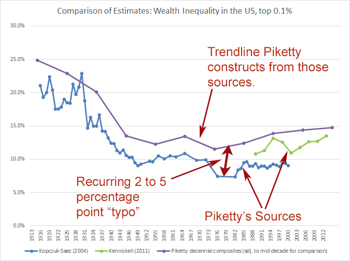 "
"
He observes that Piketty's adjustments are different from the raw data. Sure - everyone already knows that Piketty did a lot of work adjusting and splicing the raw data. Phil's approach is to:
1. Point out something everybody knows.
2. Not do any work understanding why the adjustment occurs.
3. Publish an article alleging malpractice and even more inflammatory blog posts calling them "typos".
This is what pissed me off the most in my points 2 and 4. People have gotten unduly impressed with Magness because he spent some time this summer and fall in the technical appendix without doing any real replication work. He attacks Piketty's integrity while readily admitting that given what's in the technical appendix he actually doesn't understand why the adjustments were made.
On the first issue, Magness just linearly interpolated the 1960 SCF/K&S ratio to the 1920 SCF/K&S ratio and lo and behold it's very close to Piketty's result! You know why? Because that's more or less what Piketty did. This is of course not what I suggested. I didn't say interpolate between 1960 and a year we didn't even have an empirical SCF/K&S ratio - I said project the SCF/K&S ratios backwards. The decline in the ratio from the present to 1960 is much steeper than the two steps Piketty uses (first to 1.25 then to 1.20). If we are being conservative - e.g., making the decline as shallow as possible - we can project back using the smallest rate of decline in the multiplier from the 1960-2000 period which is 0.04 per decade. If you project back using that rate of decline than the difference in the wealth share in the depression decade is 2.4 percentage points - about the magnitude of a departure that Magness gets so upset about elsewhere.
The second two issues are more minor (although they still make about a percentage point difference each - which makes me think he botched something there too - put those together and it's about the magnitude that Phil got upset about elsewhere). My claim was never that they make a substantial difference - indeed I said "it only has minor effects". Phil is missing the point, which is that he's hunting for (cherry picking you might say, if he was aware of this stuff) differences that "help the narrative" without giving a full accounting of all the data decisions that in the end looks much more balanced. Of course anyone can compile a list of data decisions that make it look like he's gaming things, but if you ignore the others that starts to get suspicious.
My bigger issue is with crap like this from Phil:
"Also recall that the persons making this claim have been quite content to casually overlook multiple instances where Piketty massaged the very same data in favor of his narrative, yielding divergences of 5 percentage points (and higher) between Piketty’s constructed trend line and his claimed data sources. For an example see this wherein Piketty’s trend for the top 0.1% is compared against his raw sources:
"He observes that Piketty's adjustments are different from the raw data. Sure - everyone already knows that Piketty did a lot of work adjusting and splicing the raw data. Phil's approach is to:
1. Point out something everybody knows.
2. Not do any work understanding why the adjustment occurs.
3. Publish an article alleging malpractice and even more inflammatory blog posts calling them "typos".
This is what pissed me off the most in my points 2 and 4. People have gotten unduly impressed with Magness because he spent some time this summer and fall in the technical appendix without doing any real replication work. He attacks Piketty's integrity while readily admitting that given what's in the technical appendix he actually doesn't understand why the adjustments were made.
Friday, January 16, 2015
Very quick, context free thoughts on Magness & Murphy (forthcoming) and Piketty's Figure 10.5
Bob Murphy had asked me to read his new paper with Phil Magness a little while ago to get reactions before it was released, and I was swamped and didn't get a chance to. Still semi-swamped, I read it tonight, but I don't want Bob to take this as ambushing. I genuinely hadn't had a chance when he initially sent it. I do want to give some thoughts about how I think people should approach the paper.
1. Accept all the botched history stuff and don't get hung up on it. A lot of people have focused on this and it is understandably frustrating Bob. It's not the main event - it's a little context of sloppiness on Piketty's part that sets the stage for the rest of the paper. A hook, if you will. And it has hooked some major news outlets.
2. So moving on from the botched history my biggest reservation is that despite the fact that they went into the excel files they really only take a superficial look at the massive empirical undertaking here and then just raise a bunch of red flags when things aren't immediately obvious from the technical appendix. This technical appendix is quite big actually. I get the impression that some people don't realize how sparse these things sometimes are. Behind a technical appendix is of course all the data and code itself and you are never going to be able to reproduce that exactly from the appendix. That is not a problem - sometimes you have to actually make the effort of emailing the author and tracking that stuff down. Replicating studies is extremely tedious work. The one time I've done it (not even for anything we were publishing - just to get a sense of what another author was doing) it required extended email conversations with the author and looking over their code and data. It's a big undertaking. That's not what Magness and Murphy seem to have done. They seem to have just shrugged their shoulders when they weren't sure what was going on in the technical appendix and then started hoisting up a bunch of red flags.
3. So a running theme in the paper is that Piketty makes all these data decisions and they all always seem to work in his favor. Of course when you're splicing together data there are a bunch of ways to do it and you're going to make a lot of data decisions for all sorts of reasons that are likely not all going to be enumerated in the technical appendix. So I took a closer look at the data that went into Table 10.5 (again - I did this exercise a couple months ago just to understand what he was doing but didn't really jot it down), curious if Magness and Murphy were really right that at every stage of data decision, where Piketty could have gone another way, it always helped his narrative. It didn't take very long to find at least three cases in the one figure.
3a. First, Piketty splices the K&S series with the SCF series using a multiplier. It shifts the level of the K&S series up but preserves the trend. The multiplier is of course based on years where both SCF and K&S data are available. However, Piketty uses a stable multiplier of 1.25 for the 1930s through the 1950s - the period when capital took a big hit from depression and war. The stable multiplier is an odd choice because the SCF/K&S ratio is actually declining as you go back in time. If you project the trend in the multiplier rather than using a stable multiplier you'd get a multiplier that's lower than 1.25. But Piketty, for whatever reason, didn't do that. Failing to project the multiplier back and instead using a fixed multiplier of 1.25 results in a higher top 1% and 10% wealth share for the 30s, 40s, and 50s than there otherwise would have been making the reduction from depression and war less dramatic and therefore the rise in wealth inequality less dramatic than it would have been otherwise.
3b. Magness and Murphy complain that Piketty uses SCF for the 1960s before jumping back to K&S in the 70s. The reason of course is that there are no SCF data points in the 70s. But what is the effect of using the SCF in the 60s - of making this a "Frankenstein" graph, in Magness and Murphy's words? Well if instead they had continued with the way they were adjusting the K&S series and waited until the 1980s to introduce the SCF, the 1960s point would have actually showed lower inequality. So by using the SCF in 1960 they are making the mid-century Golden Age a little less Golden, working against his narrative.
3c. Moving on from the 1960s, Magness and Murphy then complain that the K&S data is used in the 1970s to make a distinct trough in the U-shape for wealth inequality. (This is actually a slight mistake on Magness and Murphy's part. The data comes from the 1960 data point and only the growth rate from 1960s to 1970s is borrowed from K&S.) So what's the alternative? Well instead of using the 1960 SCF figure and projecting forward using K&S growth rates the other thing he could have done is use the K&S inequality data and then harmonize it the same way he harmonized the 30s-50s. Which multiplier would you use? The stable 1.25 multiplier or the 1.29 estimated multiplier from 1960? It turns out it doesn't matter - no matter how you calculate that alternative it's actually lower than what Piketty ended up doing. So once again, Piketty's data choice for the 1970s - taking the 1960 SCF and applying K&S growth rates - made the trough less deep than it would have been if he used the K&S data itself.
So there's three examples that I just saw and thought were worth sharing. I'm sure there are lots of others. And the point isn't to suggest that Piketty is being overly conservative. I'm sure some data choices "helped" him. My point is simply that there are a bunch of decisions to be made and picking out a few that helped him doesn't make much of a case against him. All of these decisions seem fairly reasonable whatever ultimate decision is made, and it only has minor effects anyway.
4. So one last point - again I am worried that Magness and Murphy rushed through this (it's only been six or seven months since he was first blogging on it) when they write that "Figure 10.5 continues from there as he extrapolates a wealth distribution for the top 10% by simply appending fixed percentages without further explanation". So this is really worrisome. He actually does give explanations. The fixed percentages come from the SCF studies. Now the Kennickell study is a little confusing to track down because it's posted as Kennickell 2000 at the Federal Reserve but then there's a 2001 updated version that Piketty cites. But all of it's quite easy to track down and find the "fixed percentages" that are appended. Like Magness and Murphy I wasn't quite sure what was going on everywhere, but the idea that it's there "without further explanation" is plain nonsense. So is this as really as deep as they went? I don't know - it seems like they were stumped as soon as they came across those fixed percentages. But it reinforces my impression that this big hole they've allegedly blasted in Piketty simply amounts to giving up any time they ran into a head scratcher in the technical appendix.
I am now curious about a couple things:
1. Did Magness and Murphy notice the three points I made here where Piketty's data decisions work against his narrative? And if they did why didn't they include them?
2. Did Magness and Murphy even try to email Piketty and ask for do-files, etc.? (This is a little less relevant for Figure 10.5 but more relevant for some of the other wealth series, particularly the UK).
3. What did the referee reports at the Journal of Private Enterprise say? I'm really curious about where the referees pushed back.
Wednesday, January 14, 2015
A few quick thoughts on the Piketty AEA session
The video is here. I finally got a chance to watch it. Some quick reactions:
1. In order of how interesting the presentations were, the ranking IMO clearly goes Weil > Mankiw > Auerbach. The attention received has been exactly the reverse (assuming we're not counting the attention to hecklers as attention to Mankiw's actual presentation). I want to be clear - I think Auerbach actually had a very nice presentation. It was just mostly dealing with some standard optimal tax theory stuff which I didn't find as interesting.
2. Mankiw made a point that I have been making about Piketty for a while now: r > g is great for the capital share chapters but doesn't give you much on the inequality chapters. Piketty generally did not do a great job connecting up those two big sections of the book. Piketty nods to the point but doesn't do it justice in his response to Mankiw (he acknowledges r > g doesn't matter for income inequality but maintains it's important for wealth inequality).
3. Weil and Makinw have inspired me to write a QJE paper that puts human capital into Piketty's story and leads with the line "This paper takes Thomas Piketty seriously." Now note I'm not saying I'll actually do it - just that they inspired me. This is very much related to a discussion I had with Evan the other day about how Piketty botches his criticism of Goldin and Katz. I don't think he does any better in his response to Weil. On that point...
4. Piketty does a ton of good work and some people don't seem to realize that. And he anticipates a lot of dumb arguments already so most of the things that people think are oh-so-obviously-wrong in Piketty are often not even in Piketty! But he definitely seems slow to react to good arguments and very entrenched in his views.
Thursday, January 8, 2015
Brad DeLong: Consistently my most repostable commenter. More on Krugman and scatter plots.
Brad leaves some thoughts, on which I'll just add a few of my own:
Yes definitely! In fact I'd be even more optimistic than that. Fiscal policy is endogenous to macroeconomic conditions so in addition to the particularly weak monetary offset these days I'd imagine periods in the Davies et al. series - if properly identified - would show better results for fiscal policy too. Certainly I'm not saying that scatterplots are just a mess that we can't make sense of (more on this below). He continues...
Yes to true, valid, and important. It's the tests that I'm concerned about. Let me put it this way, for most of the applications we deal with for a theory to pass a scatterplot test you can't have just a theory. You have to have a theory plus a set of other ideas about what's going on in a world that's very complex, endogenous, etc. Now if you wanted to you could call your theory plus all these other ideas (e.g.., that for the Davies time span the monetary offset was operating normally, etc.) the "theory" but this very quickly degenerates into either cobbling on assumptions to make it work or a wide range of different theories consistent with the same data. And that gets us right to the problem I pointed out - where some people will be siding with Krugman and some with Davies. Instead I'm just suggesting we consider it true, valid, and important, but not a good test of theory.
This is another great chance to re-emphasize my point. I do not have an aversion to scatterplots. I just put one together today for a DHHS project. I have an aversion to treating scatterplots as if they present a prima facie case for most economic theories.
"Could it be that the time series covers a long era in which for the most part the Federal Reserve is trying to manage aggregate demand and so offsetting any effects of fiscal policy on aggregate demand, while the cross section covers just an unusual short period during which central banks have lost their traction and their ability to engage in monetary offset?"
Yes definitely! In fact I'd be even more optimistic than that. Fiscal policy is endogenous to macroeconomic conditions so in addition to the particularly weak monetary offset these days I'd imagine periods in the Davies et al. series - if properly identified - would show better results for fiscal policy too. Certainly I'm not saying that scatterplots are just a mess that we can't make sense of (more on this below). He continues...
"I don't think it is that you have to believe Krugman's scatterplot or Davies's--I think that both are true, valid, important, and pose tests that any theory that we are not going to reject must pass."
Yes to true, valid, and important. It's the tests that I'm concerned about. Let me put it this way, for most of the applications we deal with for a theory to pass a scatterplot test you can't have just a theory. You have to have a theory plus a set of other ideas about what's going on in a world that's very complex, endogenous, etc. Now if you wanted to you could call your theory plus all these other ideas (e.g.., that for the Davies time span the monetary offset was operating normally, etc.) the "theory" but this very quickly degenerates into either cobbling on assumptions to make it work or a wide range of different theories consistent with the same data. And that gets us right to the problem I pointed out - where some people will be siding with Krugman and some with Davies. Instead I'm just suggesting we consider it true, valid, and important, but not a good test of theory.
"And I don't understand the aversion to scatterplots: in the end it is all scatterplots--albeit with an argument for paying attention to some pieces of the identifying variance underlying the scatter plot and not others..."
This is another great chance to re-emphasize my point. I do not have an aversion to scatterplots. I just put one together today for a DHHS project. I have an aversion to treating scatterplots as if they present a prima facie case for most economic theories.
Don't jump on the scatterplot bandwagon! Krugman and austerity
Recently Paul Krugman presented a scatterplot with change in real GDP on the y axis and change in real government purchases on the x axis, with each observation being a country. The point was to make a prima facie case for Keynesianism amidst all the noise that's out there today. Here's the graph:


The commentary he provides here is actually better than similar commentary he's provided for similar scatterplots in the past. Several times in the post he mentions the prospect that the relationship is spurious, for example. And his claim is relatively limited - only that this shows that Keynesian arguments are not crazy. That's all good. But I still want to emphasize the perils of jumping on the scatterplot-as-prima-facie-case-for-theory bandwagon, particularly when the causality is so mucky.
The problem with this approach is that then you have to figure out what to do when Antony Davies, of the Mercatus Center (co-authoring with failed Virginia gubernatorial candidate Robert Sarvis) shows you this graph and presents it as a prima facie case against Keynesianism in 2012:
The axes are fundamentally the same with some minor tweaking (growth in real GDP per capita instead of real GDP, and federal spending share rather than federal spending). We can quibble about those tweaks (Krugmans are the more natural test of Keynesianism), but the big difference between the two graphs is that Davies's looks at the U.S. throughout it's history and Krugman's looks at a very short panel (so a little more than a cross section) of countries.
Now the difference between the two is interesting in its own right. Why is the (essentially) cross section Keynesian and the time series austerian? We can think up lots of reasonable stories for why, but if you put them together it also suggests that Krugman's scatterplot may be suffering from a case of Simpson's paradox, with most of the relationship he's interested in determined by variation between countries rather than within countries. That opens a big can of worms because then you have to ask, independent of any short-run policy decisions, why countries show so much variation and how much that variation can really tell us about short-run policy.
Antony Davies's graph of course has the same sorts of problems. The point is obviously not to defend his interpretation - I come down squarely on Krugman's side of all this in the end. The point is that using simple plots as prima facie cases for a scientific claim is bad practice, and opens you up to other people doing precisely the same thing and coming to precisely the opposite conclusion. How could you deconstruct Davies's argument without simultaneously deconstructing Krugman's? At the end of the day people will shake out into two groups: (1.) the people who know the problems these scatterplots pose are going to be unconvinced by both of them, and (2.) the people who don't know the problems and are going to be convinced perhaps by Krugman, but maybe by Davies - most likely whoever they agreed with in the first place.
I do think there's a role for graphs like this, and it's something that Krugman pointed out at the beginning of his post - simply informing people about the performance of different countries. I am not especially clued in to what's going on in Europe, for example. This sort of thing gives me a sense of one aspect of what's going on over there. But it shouldn't be used to defend Keynesianism.
Simon-Wren Lewis has a nice post up that does defend Keynesianism/ZLB problems from Sachs that does not rely on this stuff. He actually constructs a counterfactual to think about, which is precisely what's missing from the descriptive statistics Krugman and Davies have presented.
Subscribe to:
Posts (Atom)

